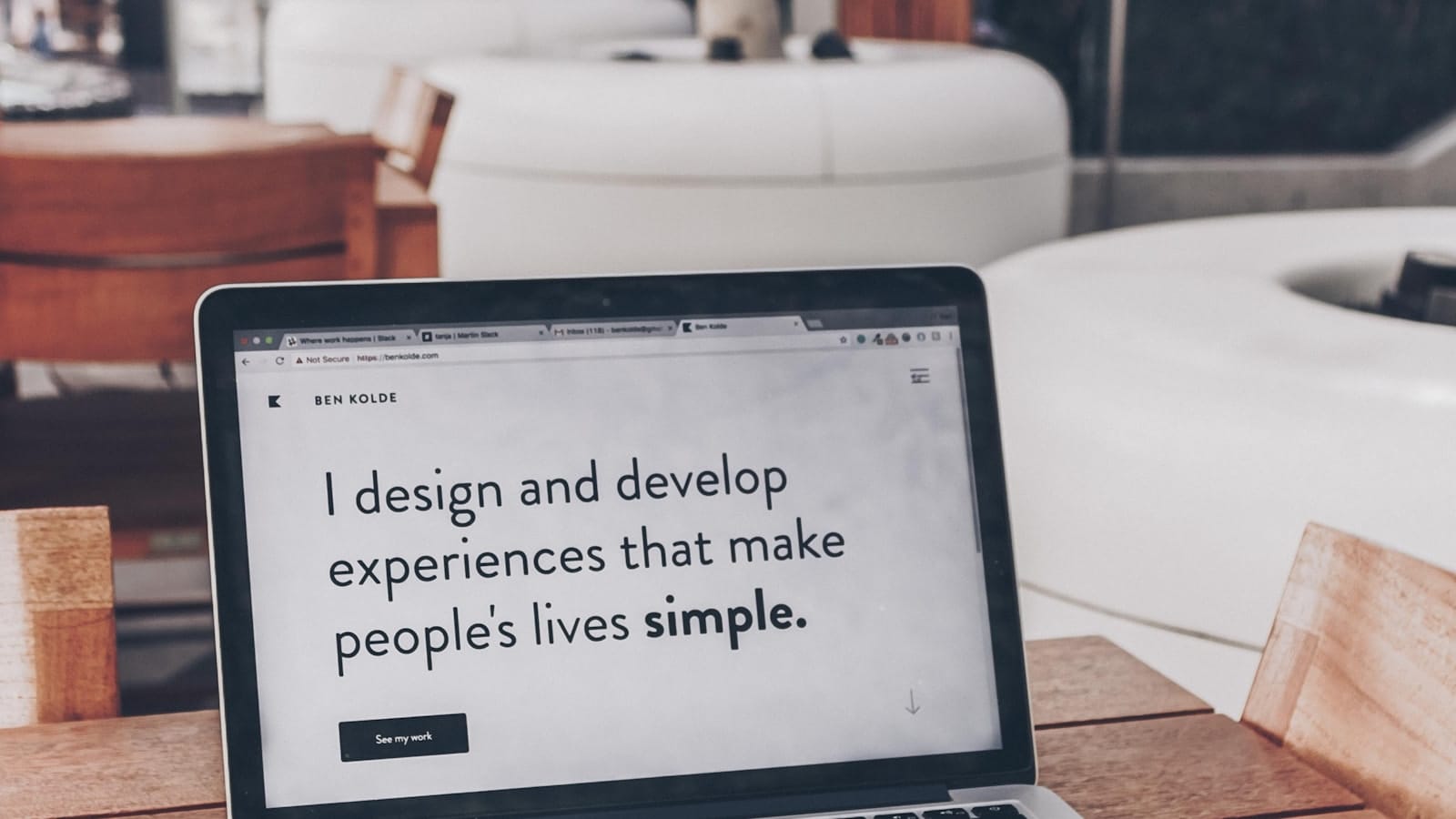
Design decisions become more useful when they follow the customer journey rather than starting with a visual style. For a small business, the most useful decisions are usually the ones that make everyday work clearer for the team and simpler for customers. That means looking beyond a checklist of features and paying attention to the moments where a person needs reassurance, information or a straightforward next step.
There is no single setup that suits every organisation. The important thing is to understand the practical job the website or digital tool needs to do, then make choices that support that job consistently. The following ideas offer a sensible starting point.
Start with the real purpose
People arrive with a task in mind, whether that is comparing an option, checking credibility or finding a way to get in touch. A useful starting point is to describe the outcome in plain language. If a customer, colleague or member cannot quickly see how the page or process helps them, the experience is likely to feel more complicated than it needs to be.
Keep the focus on visitor intent, questions, decision points and useful journeys. These are not decorative details: they are the working parts of a helpful online experience. When they are considered early, the resulting content and structure tend to be easier to maintain as the business changes.
Make the next step easy to understand
The best decisions keep the experience focused on what people are trying to achieve, rather than making them work through unnecessary steps. Clear labels, sensible ordering and short explanations help people make progress without feeling pushed. This is particularly important on a phone, where a long page, a tiny control or an unclear option can quickly interrupt someone’s attention.
It is worth looking at the experience as if you have never seen it before. What would someone notice first? What question would they still have? What happens after they submit a form, choose a product or send a message? The answers often reveal improvements that are more valuable than another visual embellishment.
Use a simple, repeatable process
Map the questions a person has before, during and after choosing a provider, then let those questions shape the page order. Involve the people who deal with customers day to day, because they usually know where expectations are unclear or where work is being repeated. Their input can turn a broad idea into a process that actually fits the business.
Questions worth asking
- What is the most common task a visitor or customer is trying to complete?
- Which information do people regularly ask for before they can decide?
- Where could a handover, follow-up or technical check be made more reliable?
- What needs reviewing after the first few weeks of use?
Answers do not need to be perfect before work begins. They do, however, provide a practical basis for deciding what is essential now and what can wait until there is real feedback.
Avoid solving the wrong problem
Starting with a moodboard and only later trying to fit the customer journey around it. It can be tempting to respond to a visible symptom with a quick surface change. Taking a little time to identify the underlying journey usually produces a more useful result and avoids adding complexity that the team must later manage.
Regular review matters too. Customer expectations, products and priorities change, so a page or workflow should be treated as something that can be improved through observation rather than a one-off decision that is never revisited.
Keep the improvement practical
Good design can still look distinctive, but its first job is to help the right person move forward with confidence. Start with the clearest improvement, test it in normal day-to-day use and make a note of what people ask or where they pause. That steady approach keeps the work grounded in the needs of the business and the people it serves.
When the basics are clear, future decisions become less daunting. The goal is not perfection; it is a dependable experience that makes the next useful action feel natural.
Before making a larger change, revisit the evidence already available. Read recent questions from customers, check where people pause or repeat a task, and ask the team which details regularly create extra work. A short review like this keeps improvements proportionate and helps the next decision reflect real use rather than assumptions.